Overview
The Detail Editor is your primary workspace for viewing and editing information about an artifact. It provides a focused, single-record editing environment where you can manage an artifact’s key details—such as its attributes, traceability links, comments, attachments, and history—from one place.
In this article, you will learn how to:
- Open Detail Editor
- Understand the User Interface
- Use Toolbar Actions
- Work with Widgets
- Adding Attachment using Attachments Field
- Package Properties Section
- Diff Indicator Band for Modified Artifacts
- Integration Widget
- Visual Cues for Editable and Read-Only Fields
- Open OneView Document for Sections
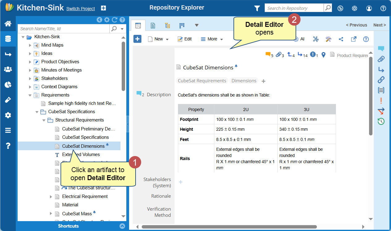
Opening Detail Editor
You can open Detail Editor in several ways:
- From Repository Explorer – Click an artifact to open it in the Detail Editor.
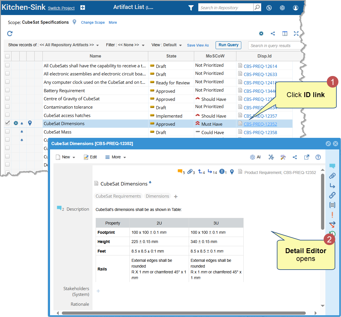
- From any editor or module – Click an artifact’s Name/Title or ID link.
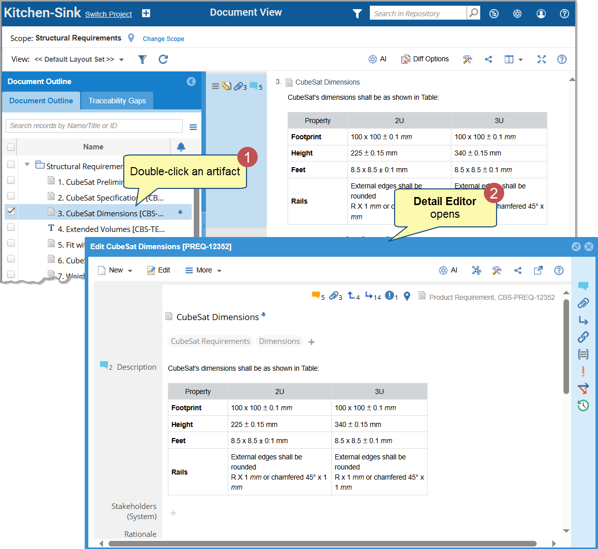
- By double-clicking – Double-click an artifact from any editor or view to open it in a pop-up window.
- In Split Window – Open the Detail Editor alongside another editor or view, such as Document View, Tree View, or OneView Document. For more details, see Using Split Window.
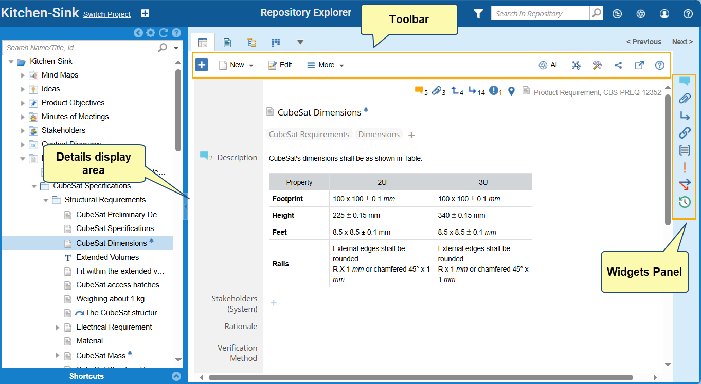
User Interface of Detail Editor
The Detail Editor interface consists of three main areas:
- Toolbar – Provides quick access to common artifact actions.
- Widgets Panel – Displays modular widgets for managing related artifact data.
- Details Display Area – Shows the artifact’s fields and attributes for editing.
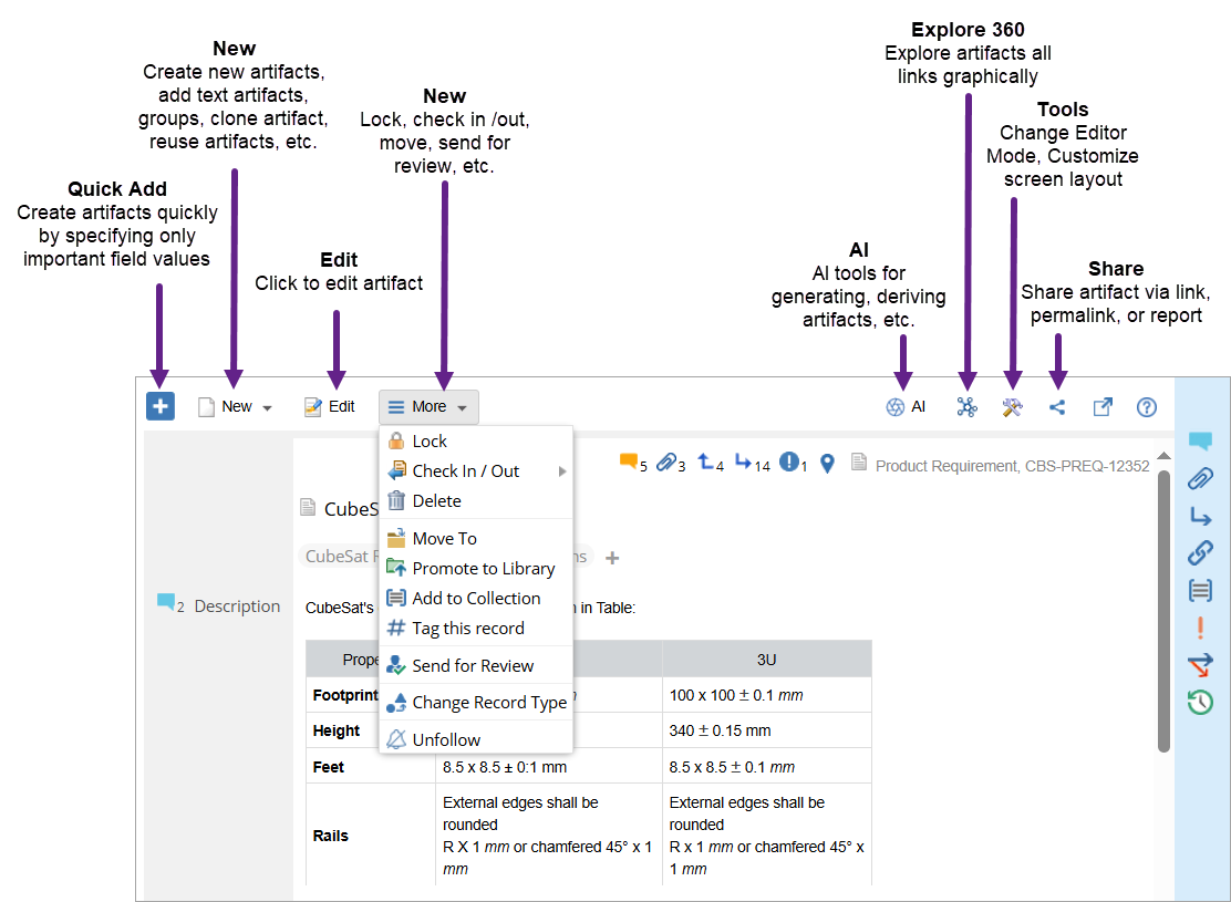
Toolbar Actions
The toolbar provides quick access to key artifact operations.
|
Action |
Help Link |
|
Quick Add |
|
|
New |
|
|
New Child |
This action is same as creating a new artifact, however, new artifacts are added as child artifacts of the selected artifact. |
|
Edit |
|
|
Check-In/Check-Out |
|
|
Delete |
|
|
More |
Moving artifacts, |
|
Explore 360 |
|
|
Share |
|
|
Full-Screen |
Open the current artifact in full-screen mode. |
|
Tools |
Change editor mode, or customize screen layout. |
Widgets Panel
The Widgets Panel provides access to additional artifact information and related actions. Each widget focuses on a specific aspect of the artifact.
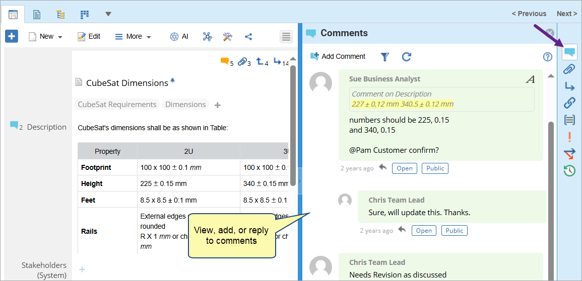
Comments
View, add, and reply to comments to collaborate with team members.
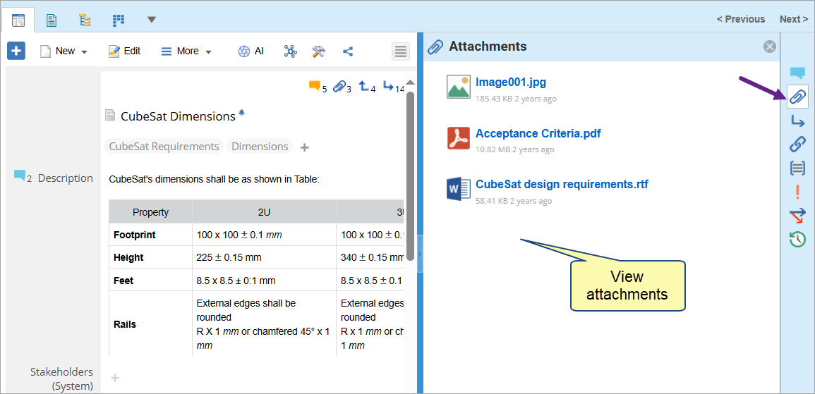
Attachments
View all files and images associated with the artifact. The widget is view-only — you cannot add or remove attachments directly from here.
To add attachments, use the Attachment field available in the artifact’s details area.
See Adding Attachments Using the Attachment Field.
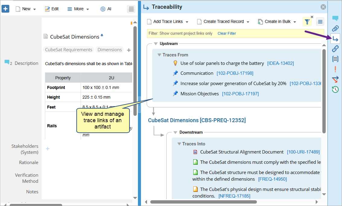
Traceability
View and manage upstream and downstream traceability links of the current artifact from current or cross projects. You can add trace links, make links suspect, remove trace links, etc.
See Using Traceability Widget.
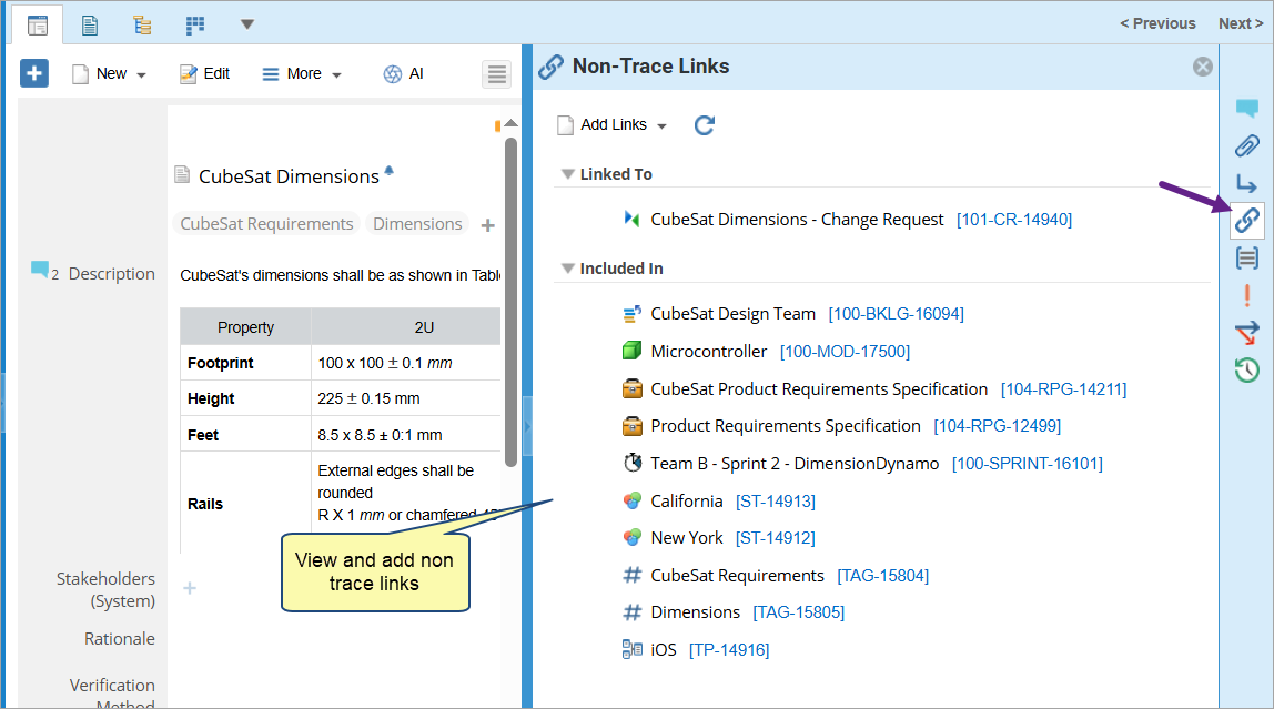
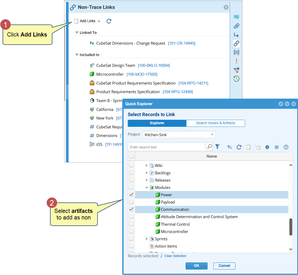
Non-Trace Links
View and add non-trace links and system-created links such as Parent, Derived Into, Impacts, etc.
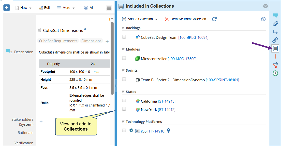
Collections
View and add an artifact to one or more collections. This widget appears only when collections exist for the current artifact.
See Adding/Removing Artifacts from a Collection.
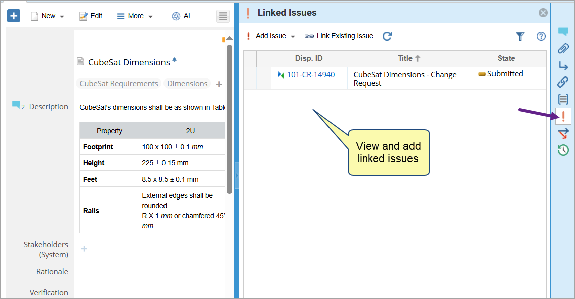
Issues
View and link issues such as Issues, Change Requests, Defects, etc., or create new ones.
See Submitting Issues.
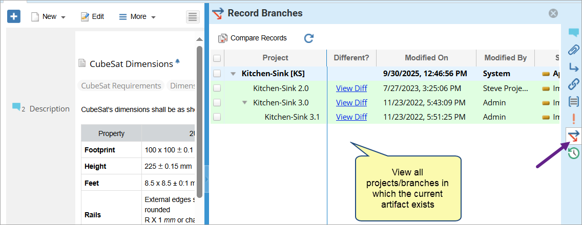
Record Branches
View all projects and branches where the artifact exists. You can check where it has been modified and compare versions to view differences across branches.
See Comparing Versions & Record Branches.
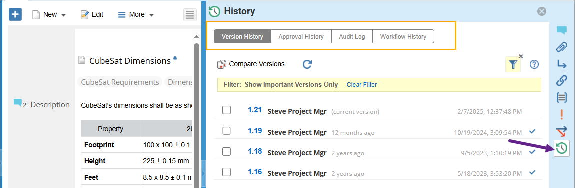
History
View change history and version details, approval history, audit log, and state transitions.
See Using History Widget.
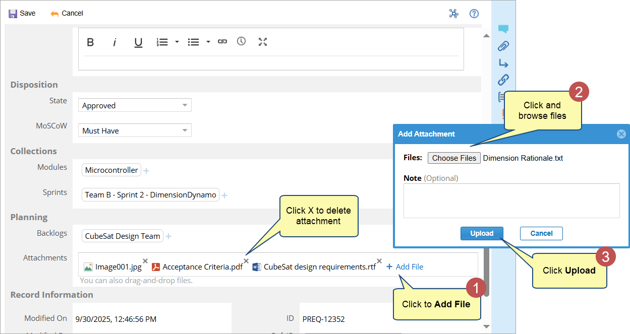
Adding Attachments using Attachments Field
Use the Attachment field to:
- Upload one or more files directly within the artifact’s details area.
- Replace or remove existing files.
- Add contextual information such as attachment name or description (if configured).
All files added through the Attachments field automatically appear in the Attachments widget, which provides a consolidated view of all files linked to the artifact.
|
TIP
|
You can also select one or more files from your local system and drag and drop them onto the Detail Editor to quickly add them as attachments. |
Package Properties Section
When a Package, OneView Document, Group or Folder is opened in the Detail Editor, a Package Properties section appears at the top of the editor.
This section provides an overview of key metadata for the selected container, such as:
- Package or document name and type
- Author, creation date, and modification date
- Package-level attributes such as description or version notes
|
NOTE
|
The Package Properties section appears only for container, not individual artifacts. |
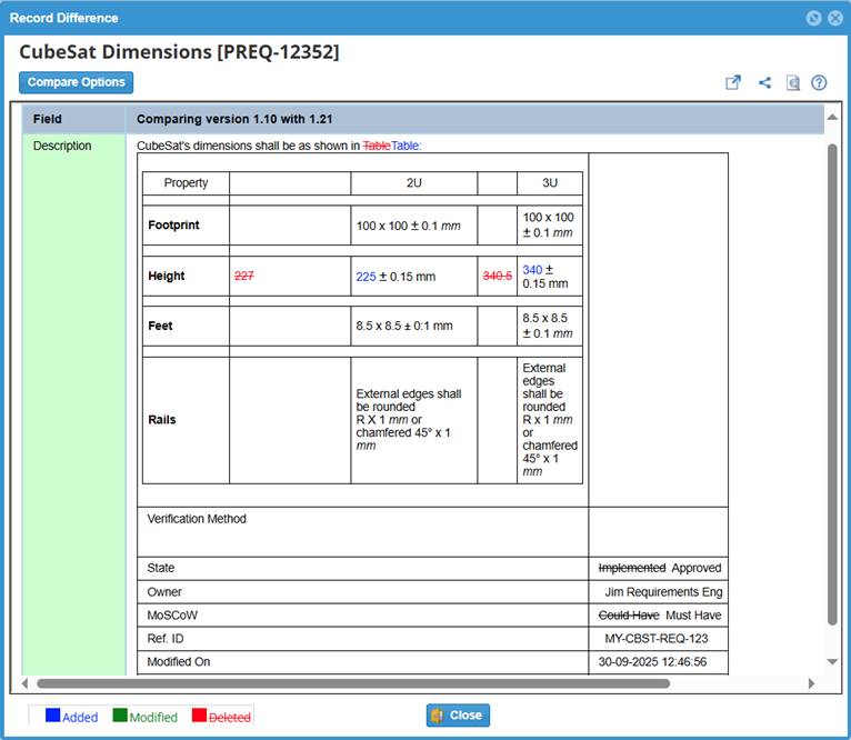
Diff Indicator Band for Modified Artifacts
The Diff Indicator Band highlights artifacts that have been modified since the date specified in the Repository Explorer’s Diff Options.
This vertical colored band appears before the artifact name and helps you quickly identify added, changed, or deleted content within text fields or descriptions.
1. Hover over the indicator band to view tooltips describing the detected changes.
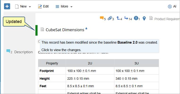
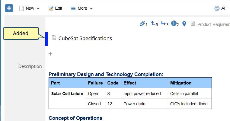
2. Click the band of an updated artifact to open a summary showing what changed, who updated it, and when.
Integration Widget
Use the Integration Widget to view external records synchronized with the current TopTeam artifact.
These records are fetched from integrated systems such as Jira or Azure DevOps.
This widget helps you:
- View synchronization details of linked external records.
- Quickly navigate to the corresponding record in the integrated system.
To view synchronized external records:
Click the Integration widget and view the details for each synchronized record:
- External Record – The linked record name or ID.
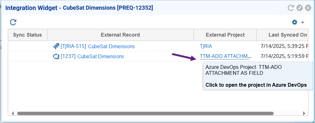
- External Project – The project in the connected system where the record resides.
- Last Synchronization Time – The most recent timestamp when synchronization occurred.
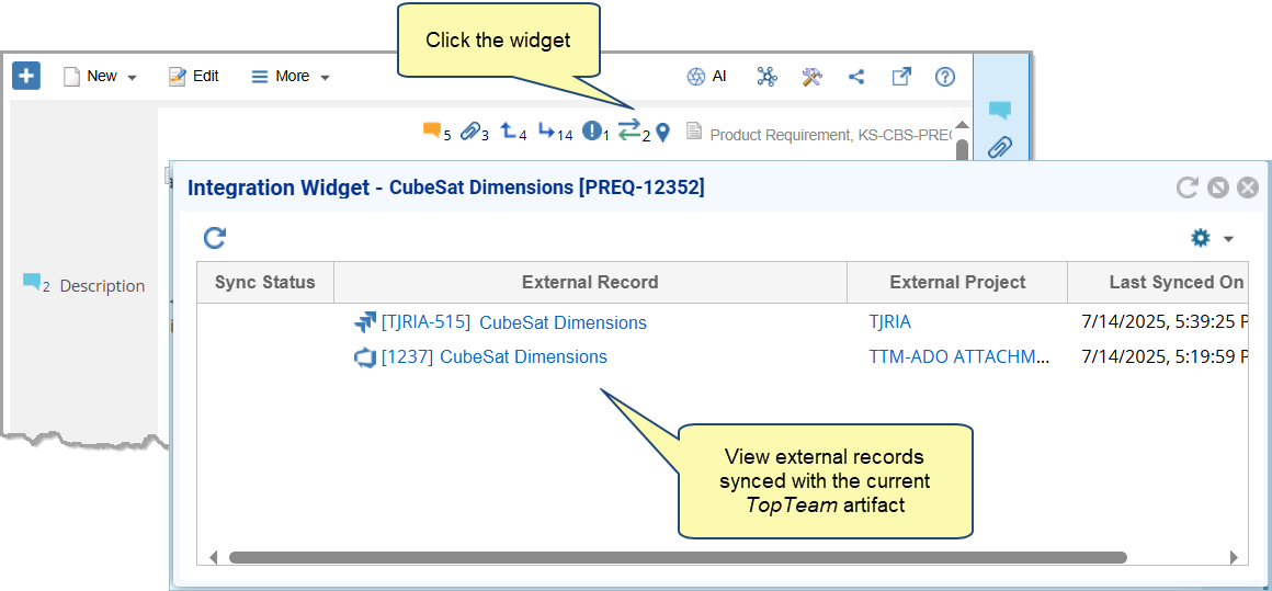
- Click the external record link to open it directly in the integrated system.
Visual Cues for Editable and Read-Only Fields
When in Edit mode, the Detail Editor displays visual cues next to fields to indicate their purpose or editability.
Field Usage Hint
An info (i) icon appears next to a field when a usage hint has been defined.
- Hover the i icon to read the usage guidance specified by the Administrator in the Customize Record Type Fields module.
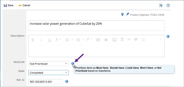
- Usage hints provide context, examples, or input expectations to ensure correct data entry.
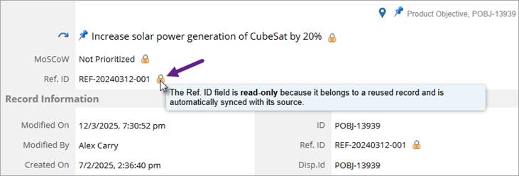
Read-Only Field
A lock icon appears next to any field that is not editable.
- Hover over the lock icon to see the reason the field is read-only, such as when the value is system-calculated, permission-restricted, or locked by a workflow condition.
- These icons are visible only in Edit mode to clearly distinguish editable and non-editable fields.
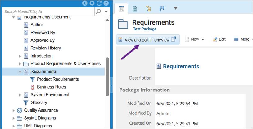
Open OneView Document for Sections
When a OneView Document package contains multiple sections, each section listed in the Detail Editor provides a View and Edit in OneView action.
Use this action to open the selected section directly in the OneView Document Editor for viewing or editing.
This allows you to seamlessly switch from the artifact’s detail view to its corresponding document section without manually navigating through the OneView Document hierarchy.
See Also
Revised: October 16th, 2025